التوازن في التصوير الفوتوغرافي Balance in Photography

تقليص
X
 
  • تصفية - فلترة
  • الوقت
  • عرض
إلغاء تحديد الكل
مشاركات جديدة

  • التوازن في التصوير الفوتوغرافي Balance in Photography

    Balance in Photography

    Balance is one of the least-discussed principles of good composition, but it is perhaps the most important. Photographers, consciously or not, make an important decision for every image: should the composition be balanced or imbalanced? To some degree, every photograph in existence has elements of both balance and imbalance, which makes this topic crucial for photographers looking to improve the strength of their images at the most fundamental level.

  • #2
    التوازن في التصوير الفوتوغرافي

    يعد التوازن أحد مبادئ التكوين الجيد الأقل مناقشة، ولكنه ربما يكون الأكثر أهمية. يتخذ المصورون، بوعي أم بغير وعي، قرارًا مهمًا لكل صورة: هل يجب أن يكون التكوين متوازنًا أم غير متوازن؟ إلى حد ما، تحتوي كل صورة موجودة على عناصر التوازن وعدم التوازن، مما يجعل هذا الموضوع بالغ الأهمية للمصورين الذين يتطلعون إلى تحسين قوة صورهم على المستوى الأساسي.

    تعليق


    • #4
      جدول المحتويات

      التوازن بين اليسار واليمين
      التوازن مقابل عدم التوازن
      التماثل
      التوازن غير المتماثل
      ما الذي يجذب العين؟
      وضع التوازن موضع التنفيذ
      عدم التوازن
      التوازن في الإطارات العمودية
      صور البانوراما
      الأهداف الصغيرة
      بعد المعالجة
      الخاتمة

      تعليق


      • #5
        Left-Right Balance


        When a photo is perfectly balanced, it means that the left and right halves of the photo draw the eye equally.

        The left-right division is the only one in your photos which really matters in terms of balance — the top-bottom balance has little effect on how evenly-weighted an image appears. In the same way, we see other people as roughly symmetrical, even though this is only true on the left-right axis. Thus, you can have a photo where all the subjects are along the bottom, and it can still be balanced if the left and right halves are equal in their visual weight.

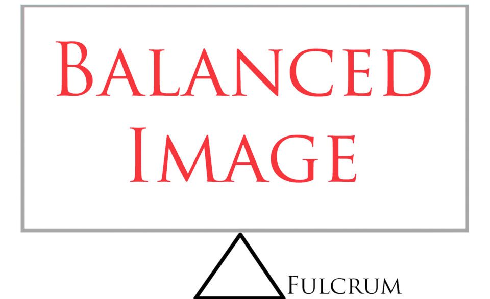
        Imagine putting a photo on a fulcrum — if the features of each side draw the eye similarly, the image can be considered balanced.


        تعليق


        • #6
          التوازن بين اليسار واليمين

          عندما تكون الصورة متوازنة تمامًا، فهذا يعني أن النصفين الأيسر والأيمن من الصورة يجذبان العين بالتساوي.

          التقسيم من اليسار إلى اليمين هو القسم الوحيد في صورك الذي يهم حقًا من حيث التوازن - فالتوازن من أعلى إلى أسفل ليس له تأثير يذكر على كيفية ظهور الصورة ذات الوزن المتساوي. وبنفس الطريقة، نرى الأشخاص الآخرين متماثلين تقريبًا، على الرغم من أن هذا ينطبق فقط على المحور الأيسر والأيمن. وبالتالي، يمكنك الحصول على صورة حيث تكون جميع العناصر على طول الجزء السفلي، ولا يزال من الممكن موازنتها إذا كان النصفان الأيسر والأيمن متساويين في الوزن البصري.

          تخيل وضع صورة على نقطة ارتكاز - إذا كانت ملامح كل جانب تجذب العين بشكل متشابه، فيمكن اعتبار الصورة متوازنة.

          تعليق


          • #7
            Balance vs Imbalance


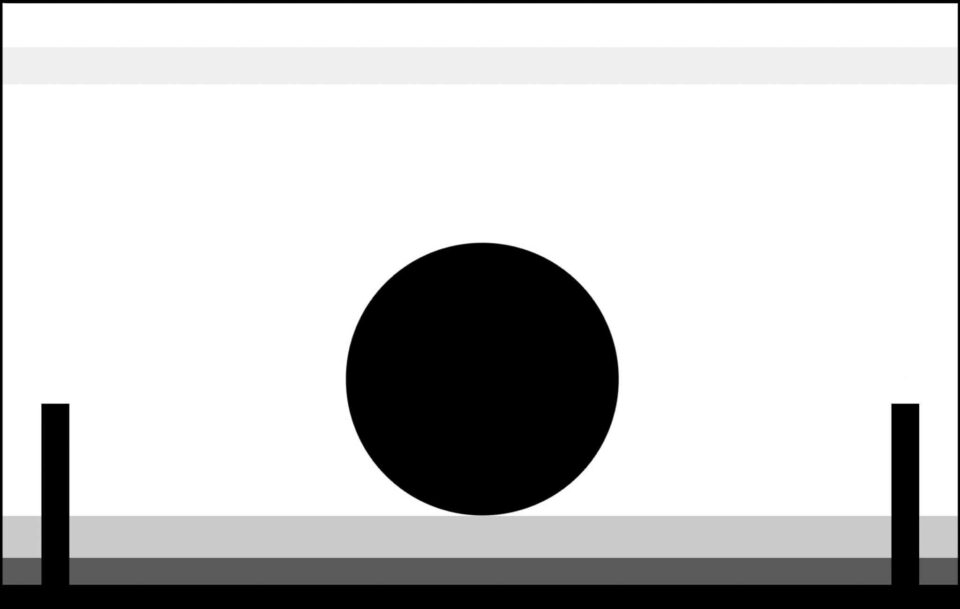
            Balance, or a lack of it, inherently makes your images appear more or less serene. With a balanced image, the frame is more calm than one which skews visual attention to one side or the other. This makes logical sense, especially when you view the image below:


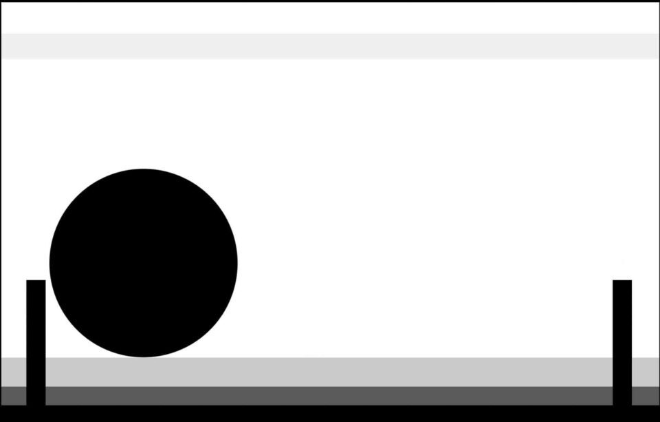
            And the second one:


            Although others may see it differently, the image on top appears far more peaceful to me. The image on the bottom, in contrast, is more tense — somehow, it doesn’t look “stable” in its current form, as though something in the frame is about to change.

            Different people may prefer one image over the other, of course. For many, a tense image can communicate a story more effectively; for others, a balanced image is more peaceful and aesthetically pleasing. It all depends upon the mood you want to communicate.

            تعليق


            • #8
              التوازن مقابل عدم التوازن

              التوازن، أو عدمه، يجعل صورك تبدو أكثر أو أقل هدوءًا. مع الصورة المتوازنة، يكون الإطار أكثر هدوءًا من الإطار الذي يحرف الانتباه البصري إلى جانب أو آخر. وهذا أمر منطقي، خاصة عند عرض الصورة أدناه:


              والثاني:


              على الرغم من أن الآخرين قد يرون الأمر بشكل مختلف، إلا أن الصورة في الأعلى تبدو أكثر سلامًا بالنسبة لي. في المقابل، الصورة في الأسفل أكثر توتراً - بطريقة ما، لا تبدو "مستقرة" في شكلها الحالي، كما لو أن شيئاً ما في الإطار على وشك التغيير.

              قد يفضل الأشخاص المختلفون صورة واحدة على الأخرى بالطبع. بالنسبة للكثيرين، يمكن للصورة المتوترة أن تنقل القصة بشكل أكثر فعالية؛ وبالنسبة للآخرين، فإن الصورة المتوازنة تكون أكثر سلامًا وإمتاعًا من الناحية الجمالية. كل هذا يتوقف على الحالة المزاجية التي تريد التواصل معها.

              تعليق


              • #9
                Symmetry


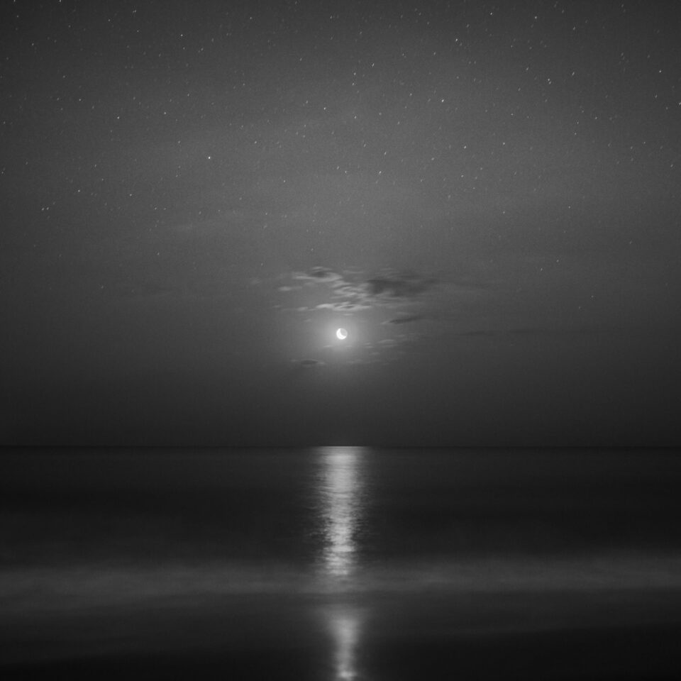
                The most obvious type of balance is one in which the image is identical on the left and right halves. Perfect, pixel-level symmetry is not possible outside of computer-generated images, but a nearly-symmetrical photo is more than enough for us to notice a balanced composition. Take a look at the image below:
                Nikon D7000 + 24mm f/1.4 @ 24mm, ISO 400, 30/1, f/1.4
                Sure, the patterns in the stars are different on each side of the photo, but this scene is about as symmetrical as it could be. The subject is in the very center of this photo, and each side has essentially the same visual weight as the other. I even chose a square format to emphasize the balance of this image.

                The main issue with symmetry is that most scenes do not have two identical halves. And, if you do work in a genre with readily-available symmetrical subjects (say, architectural photography), your images will grow old if you compose them all the same way.

                تعليق


                • #10
                  تناظر

                  النوع الأكثر وضوحًا من التوازن هو الذي تكون فيه الصورة متطابقة في النصفين الأيسر والأيمن. لا يمكن تحقيق التماثل المثالي على مستوى البكسل خارج الصور التي يتم إنشاؤها بواسطة الكمبيوتر، ولكن الصورة شبه المتماثلة هي أكثر من كافية بالنسبة لنا لملاحظة تكوين متوازن. ألق نظرة على الصورة أدناه:


                  من المؤكد أن أنماط النجوم تختلف على كل جانب من جوانب الصورة، ولكن هذا المشهد متناسق قدر الإمكان. يقع الموضوع في منتصف هذه الصورة، وكل جانب له نفس الوزن البصري للجانب الآخر. حتى أنني اخترت تنسيقًا مربعًا للتأكيد على توازن هذه الصورة.

                  تكمن المشكلة الرئيسية في التناظر في أن معظم المشاهد لا تحتوي على نصفين متطابقين. وإذا كنت تعمل في نوع ذي موضوعات متناظرة متاحة بسهولة (على سبيل المثال، التصوير الفوتوغرافي المعماري)، فإن صورك سوف تصبح قديمة إذا قمت بتأليفها بنفس الطريقة.

                  تعليق


                  • #11
                    Asymmetrical Balance


                    A photo does not have to be symmetrical to be balanced. Take the image below as a simple example — the sun is an important subject on the right-hand side of the image, but the wave pattern on the left draws the eye just as much:
                    D800e + 24mm f/1.4 @ 24mm, ISO 100, 1/5, f/16.0
                    Most examples are not this obvious, where each half of the photo has a subject that attracts equal attention. For example, the main subject could be on one side of the image, but several small subjects on the other side balance the frame. Or, the subject could be large enough that it spans the length of the image, effectively balancing itself.

                    For an image to be balanced, each side must call for the same level of attention from a viewer.

                    تعليق


                    • #12
                      التوازن غير المتماثل

                      ليس من الضروري أن تكون الصورة متماثلة حتى تكون متوازنة. خذ الصورة أدناه كمثال بسيط - الشمس موضوع مهم على الجانب الأيمن من الصورة، ولكن نمط الموجة على اليسار يجذب العين بنفس القدر:


                      معظم الأمثلة ليست بهذا الوضوح، حيث يحتوي كل نصف من الصورة على موضوع يجذب نفس القدر من الاهتمام. على سبيل المثال، يمكن أن يكون الهدف الرئيسي على أحد جانبي الصورة، ولكن هناك عدة أهداف صغيرة على الجانب الآخر تعمل على موازنة الإطار. أو يمكن أن يكون الهدف كبيرًا بما يكفي ليمتد على طول الصورة، ويوازن نفسه بشكل فعال.

                      لكي تكون الصورة متوازنة، يجب أن يستدعي كل جانب نفس المستوى من الاهتمام من المشاهد.

                      تعليق


                      • #13
                        What Attracts the Eye?


                        To know how to balance a photo, you need to know what attracts viewer’s eyes in a photo. Here’s a short list:
                        1. Areas of contrast
                        2. Items that are in focus (especially if most of the photo is not)
                        3. Bright spots
                        4. Saturated items
                        5. Warm (red/yellow) colors
                        6. Large items
                        7. People and (to a lesser extent) animals
                        8. The eyes of your subject
                        9. The direction that your subject is looking (even if it is an empty space, it gains visual weight because viewers will want to look the same direction as the subject)

                        This is by no means a comprehensive list, but it’s a good place to start. Any time that an item in the photo stands out compared to the rest of the image, it holds some amount of visual weight. If you are trying to balance your photo effectively, you must arrange the items so that they cancel out each other’s visual effects.

                        Again, like placing the image on a fulcrum, objects that are near the edges of your photo will carry more weight than those closer to the center. So, to balance two similar objects across the frame, you would place them at a similar distance from the center. Or, if there is just one important object in your composition, the most balanced composition places it along the center line.

                        تعليق


                        • #14
                          ما الذي يجذب العين؟

                          لمعرفة كيفية موازنة الصورة، عليك معرفة ما يجذب أعين المشاهد في الصورة. إليك قائمة قصيرة:

                          مناطق التباين العناصر التي يتم التركيز عليها (خاصة إذا لم تكن معظم الصورة كذلك) النقاط المضيئة العناصر المشبعة الألوان الدافئة (الحمراء/ الصفراء) العناصر الكبيرة الأشخاص و (إلى حد أقل) الحيوانات عيون موضوعك الاتجاه الذي ينظر إليه هدفك (حتى لو كان كذلك) مساحة فارغة، فإنها تكتسب وزنًا بصريًا لأن المشاهدين سيرغبون في النظر في نفس اتجاه الموضوع)

                          هذه ليست قائمة شاملة بأي حال من الأحوال، ولكنها مكان جيد للبدء. في أي وقت يبرز فيه عنصر ما في الصورة مقارنة ببقية الصورة، فإنه يحمل قدرًا من الوزن البصري. إذا كنت تحاول تحقيق التوازن في صورتك بشكل فعال، فيجب عليك ترتيب العناصر بحيث تلغي التأثيرات المرئية لبعضها البعض.

                          مرة أخرى، مثل وضع الصورة على نقطة ارتكاز، فإن الكائنات القريبة من حواف صورتك ستحمل وزنًا أكبر من تلك القريبة من المركز. لذا، لتحقيق التوازن بين جسمين متشابهين عبر الإطار، عليك وضعهما على مسافة مماثلة من المركز. أو، إذا كان هناك كائن واحد مهم فقط في تكوينك، فإن التكوين الأكثر توازناً يضعه على طول خط المنتصف.

                          تعليق


                          • #15
                            Putting Balance into Practice


                            To change the balance of an image, take a quick look at the left and the right halves of your frame. Mentally note how many important visuals are on each side, checking for the items on the list above. Take care to think about the distance of each object from the center of the frame — even objects that do not normally draw attention will appear obvious if they are near the edge of your photo.

                            Adjust the composition to taste, making it more balanced by shifting the frame to have equal visual weight on both sides, or by excluding distracting objects from the composition altogether.

                            This takes practice, of course, but a lot of your knowledge about compositional balance is intuitive. This is why beginners tend to put their subject in the very middle of every frame, no matter the situation. We are inclined to take balanced photos by our nature, and proper practice can show us how to achieve this in more complex scenes.

                            Your photos do not need to be completely balanced to appear peaceful. Still, when you are composing a photo, it is important to realize that vastly imbalanced frames will cause tension with viewers. This isn’t necessarily bad, depending upon your goals, but tension is something that many photographers try to avoid in their images.

                            تعليق

                            يعمل...
                            X